Candlestick charts: Introduction
by PRASHANT SHAH -
Candlestick charts are probably one of the most popular and widely followed charting method. It is considered to be among the oldest Japanese charting method.
The early form of candlestick chart patterns was explained by Homma Munehisa in his in book titled The Fountain of Gold – The Three Monkey Record of Money. This book was published in 1755. Originally a rice merchant from Sakata, Japan – Homma became expert rice futures trader at Dojima Rice exchange of Osaka. He is considered as the father of Candlestick charts. In Japan, candlestick charts are called as Sakata charts, named after Homma’s native place.

Steve Nison in 1991, introduced the Japanese candlestick charting method to the Western and other part of the world through his book titled “Japanese Candlestick Charting Techniques”.
Like the bar chart, the candlestick chart too captures the four prices of a session namely the open, high, low, and close. Most of the things are similar to the bar chart. There are however two key differences. Let us understand them.
Open and Close
In candlestick chart, we connect the open and close price on the bar chart and draw the box. See the below image.
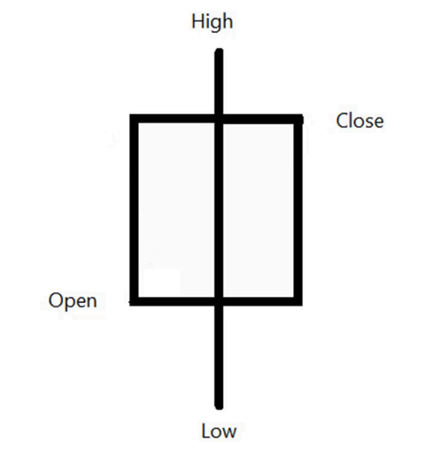
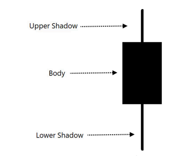
This box, that is drawn connecting the opening and closing price, is known as the body of the candlestick. The line or projection above the body is known as the upper shadow and the line or projection below the body is known as the lower shadow.
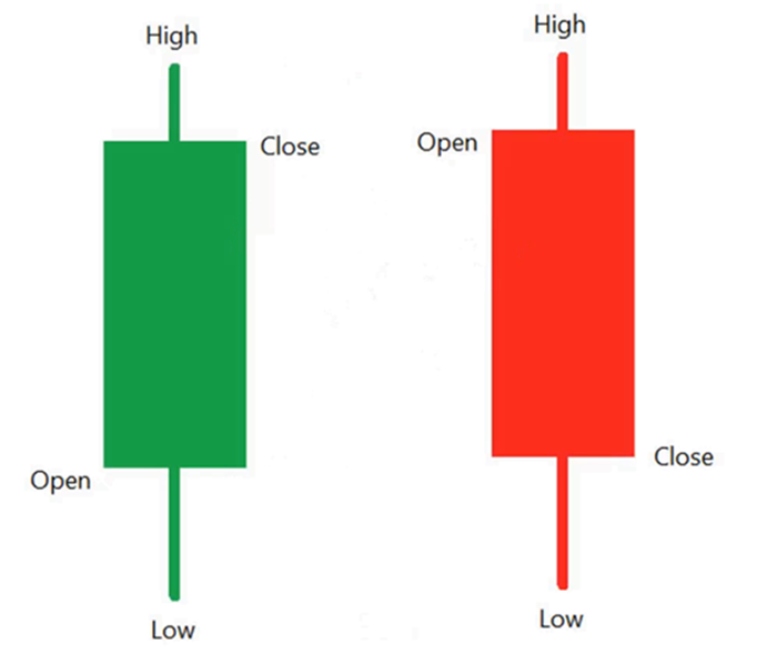
Color of the chart
Unlike the bar chart, the colour of the candle is not decided based on the previous close. If the close of the session is higher than the open, the candle is considered bullish and is usually color coded in green. If the close of the session is lower than the open, the candle is considered bearish and is color coded in red.
See the below image.
Body and shadow are two most important properties of the candlestick charts
Featured below is a Daily candlestick chart of Nifty.

Like the line and bar chart, candlestick chart can also be plotted on different timeframes including EOD and Intraday time frames. The concept is applicable to all instruments.
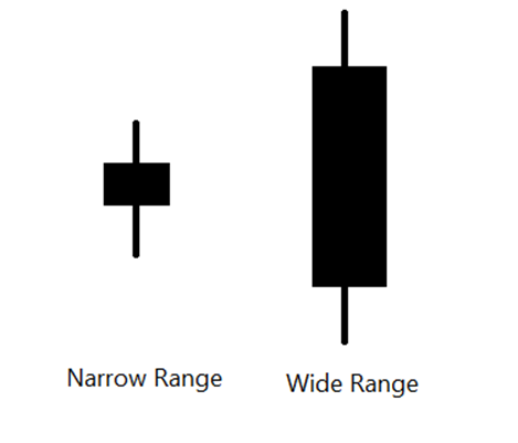
Like Bar chart, the size and length of the candle conveys more about trend and volatility during the session. The plotting of the chart is visually appealing, and we can immediately gather information about the trend and volatility of the session.
See the below image showing narrow and wide range candles.
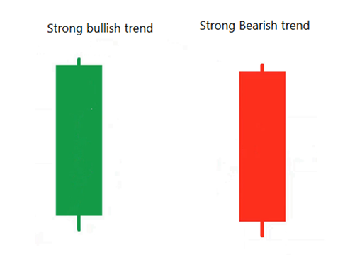
The strength of the trend in a trading session can be understood by looking at the body of the session.
Wide range candle with strong body is sign of a strong trend. See the below image.
A wide range with a small body is a sign of volatility.
See the below image.

The body of the candle A and B are comparatively small in the above image. It shows that there was not much difference between the opening and closing price, but the shadows are lengthy suggesting that the price swing was very wide during the session. In candle C, there is almost no difference between the opening and closing price. The price closed where it opened but there was a lot of back-and-forth activity during the session. These candles indicate indecisiveness amongst market participants about the trend. We will soon discuss more about these patterns.
Here is the daily candlestick chart of Nifty.
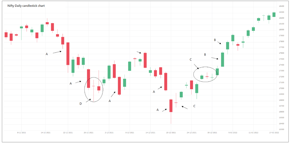
Candle marked A are strong bearish candle which can be easily observed by large red bodies. Candle marked B are strong bullish candles because of their larger bodies. Observe patterns highlighted at circle C. These are relatively small range candles showing narrow market session. Observe candle D – it is a relatively large candle with almost no body. It shows big action in the market but almost no decisive trend. It is an indication of a volatile session.
Everything else that we discussed relating to the bar chart is also applicable on the candlestick chart.
Main features of the Candlestick chart:
- Takes price and time into account: price is plotted on the Y-axis and time on the X-axis
- Plots Open, High, Low, Close price of the session. We get all information of the session at glance.
- Color of the candle depends on the open and close of the same session. If close is higher, it is a bullish candle. Else, it is a bearish candle.
- The trend during the session, the open and close can be analysed using candlestick pattern
- Size or the length of the candle tells us more about the session, trend, and volatility.
- Candles have body and shadow
- We clearly get to see body and shadows. If body is large, the trend was strong. If shadows are large, the session was more volatile.
- You can see volume on the selected timeframe. Total volume for that session is plotted below each candle.
- You can identify gaps.
The candlestick charts became very popular because of its simplicity and usefulness. The length of the candles and the patterns that they produce using body and shadows turned out to be very appealing to traders and investors from the analysis perspective.
Now that we have discussed the basics of candlestick charts and their important properties, let us discuss more about the candlestick charts.
In Definedge products like TradePoint and Zone, there are more than 130 predefined candlestick patterns. The point is, we have explored many price patterns and possibilities in the candlestick chart.
In 2009, I made a notebook of all possible candlestick patterns and their explanation. Hand drawn patterns and wrote their characteristics. It helped me understand them more.
Let’s dig deeper into the candlestick chart and discuss more about them.