Strength & Weakness
by PRASHANT SHAH -
We often use the words strength and weakness in markets about stocks and instruments. We often say that a particular stock or instrument is strong. This typically indicates that the behaviour of the instrument is more bullish. There are numerous tools to arrive at this conclusion, including the simple screen or tape reading.
I believe that knowingly or unknowingly, every trader or investor performs relative strength analysis. Just that a few of them are not doing it structurally or methodologically, and they probably do not even realize that they are doing it.
During my initial years in trading, I used to spend a lot of time on screen reading or tap reading and made several observations, but I did not have an idea about relative strength analysis back then. Eventually, I could connect some dots. There are many aspects to relative strength analysis. Let us understand the subject from the basics.
Strength
Take a look at the picture below. It represents a physically strong man.
Person A

Now, take a look at the man below. He seems weak.
Person B

We can simply state that these men are strong and weak without comparing them with anyone else.
Relative Strength
Take a look at the picture below. The man in Picture A is part of the group.
Group of strong men

Person C in the above picture is the strongest. A is also strong, but C is relatively stronger.
Take a look at the picture given below.
Group of weak men

Person D is weaker than the others in the group including Mr B. He is relatively weak.
Individual strengths and weaknesses matter, but when we analyze them in a group of people, we can identify who is relatively stronger and weaker. When we say strong, it is about individual strength. When we say, relatively strong, it means stronger than the others.
Now, let us extend this concept to the various stocks and sectors in the equity market.
A stock that has appreciated sharply can be considered a strong stock. Similarly, a stock falling steadily may be considered a weak stock. We can analyze the strength or weakness using the price action or any other tool. When we compare the performance of a stock with other stocks, we get to know about the relative strength and weaknesses.
Many people get confused with the relative strength (RS) and RSI (Relative Strength Index) indicators. But both are different concepts.
Relative strength is a method of identifying stocks or instruments that are relatively strong or weak while RSI is a popularly used momentum indicator.
When we discuss relative strength, the most relevant question is, relatively strong or weak when compared to what?
Let us consider the example of a group of people. For example, if the criterion for determining strength is the height of the person, then we need not necessarily look at the tallest guy; we need to look at the height of the people relative to a benchmark. We calculate the average height of the people in the group and people above the average height may be classified as relatively tall.
In the context of the stock market, the average number or the benchmark could be a stock index. We can compare the performance or returns of an instrument with a broader market index. If a stock has performed better than the market index, it is considered relatively strong or an outperformer. Bigger the outperformance, the better it is. If the stock has performed worse than the market index, it is considered relatively weak or an underperformer.
Broader market index in the Indian market context could be National Stock Exchange’s Nifty 50 index or the Bombay Stock Exchange’s BSE Sensex index. We can also compare the performance of a stock with sector indices or other stocks, but we shall discuss that later.
The goal of every investor would be to invest in stocks that can outperform the benchmark index. The primary purpose of trading or investment should be that. Otherwise, we will be better off investing in index ETFs.
Take a look at the historical price chart of the Nifty Index from 2003 to 2020.
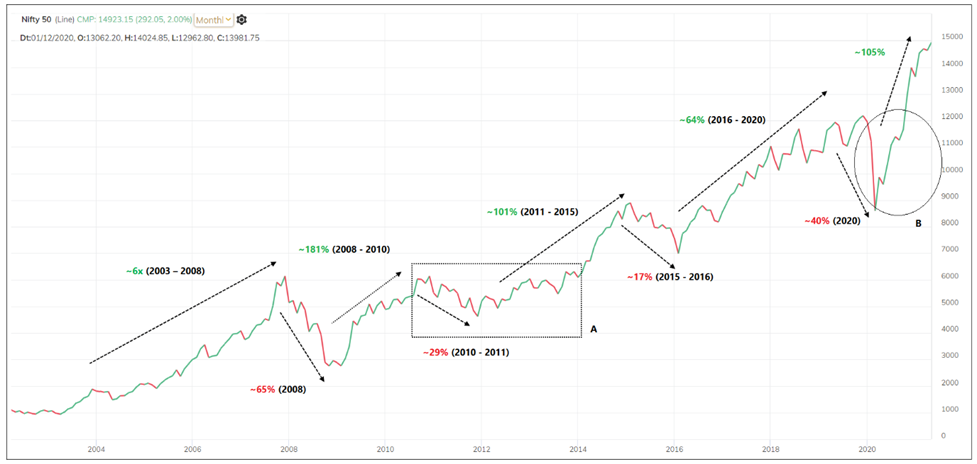
The Nifty appreciated 6x between April 2003 to January 2008. Subsequently, there was a strong correction of about 65% in the Nifty 50 index during the 2008 global subprime correction. After forming a low in October 2008, the Nifty 50 index appreciated by about 181% by November 2010.
It corrected by about 28% from November 2010 to December 2011. Subsequently, the Index doubled from the low recorded in December 2011 to the peak of March 2015. There was a 17% correction in the index between March 2015 and February 2016, followed by a strong rally of 64% between 2016 and January 2020. The slide of about 40% in the first quarter of the calendar year 2020 was sharp but short-lived. This was followed by an impressive gain of about 105% till March 2021.
Take a look at box A in the above chart when the Index was confined to a range during the four-year period lasting from 2010 to 2014. The Nifty 50 Index was flat during these four years, representing a time correction and consolidation. As against that, the price action in circle B in the above chart represents a sharp and deep correction followed by a strong bounce.
A 40% fall in the index happened in a couple of months and was followed by a 100% rise in less than a year. They were strong trends accompanied by momentum. In contrast, the bear and bull trend in box-A were less volatile compared to the price action in circle B. So, there are strong and weak trends, and there are more volatile and less volatile phases in the markets.
There are different phases such as a strong uptrend, downtrend, slow or gradual trends and horizontal phase in the above chart. But some stocks and sectors outshine others during each of these phases. There are always unique flavours or favourites of the market in every phase. There were periods when markets fell or went sideways but that does not mean that no stock or sector was going up during that period. There will invariably be better performers in every phase.
Take a look at the table given below.
Nifty Trend and Leaders
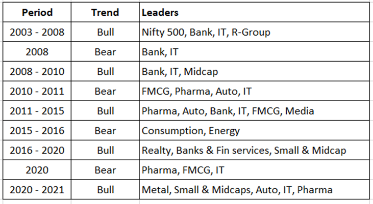
Above Table shows the leaders of each leg. Mid-cap, small-cap, Reliance group stocks, Banks and IT index did well during the 2003–2008 rally. Banks and IT fared relatively better in the fall of 2008. Banks, IT and mid-caps were the top performers during the bounce from 2008 lows to 2010 high. It was the turn of FMCG, Pharma, Auto and IT sectors to do well in the fall and consolidation between 2010–2011. Pharma, Auto, Bank, IT, FMCG and Media stocks lead the bull market that lasted between 2011 to 2015.
The Consumption and Energy sector performed well during the fall of 2015–2016. Realty, Bank, financial services, small-cap and mid-cap stocks did well during the rally that lasted between 2016 to 2020. Pharma, FMCG, and IT did relatively better during the Covid-led fall in 2020. Metal, Auto, Pharma and small-mid-cap stocks did well in the rally till March 2021.
Our portfolio will outperform if we can identify the flavour and theme of the market.
We will come back to this table again.
Let us discuss what we mean when we say a stock is relatively strong against the market.
There are two major takeaways here:
1. There are always outperformers, no matter what the trend of the market is.
2. The market leaders change in every phase.
The first point is the good news because if we know that there will be outliers, we must develop a technique to identify them for better trading and investment opportunities. Similarly, in a bearish trend, there will always be a bunch of underperformers that will fall more than the index.
The second point is the key reason why markets may recover but portfolios may not. Investors buy the strong stocks of the previous rally and keep holding them. Other stocks having better businesses, viable ideas and favourable trends may lead the markets in the next leg of the rally. Investors often think that the stocks that performed well in the recent cycle will continue to do so and hold them. But times change, and the market typically resumes the uptrend with new leaders. Hence, the market may go up, but individual portfolios can underperform.
The bottom line is that developing a technique to identify outperformers and underperformers can help us in both, trading, and investment. There are many methods of analysing prices and developing trading systems. But the key aspects in the business of trading is stock selection and a clear understanding of the market phase. The stocks that we select to trade, if identified using the relative strength concept, will be extremely rewarding as we would be focusing on outliers.
When we talk about relative strength, the initial assumption is that a stock is considered strong if it rises when the market is also rising. But that is not the right approach. When a stock performs better than the market or benchmark index, only then will it be considered relatively strong.
In the following instances, we can conclude that a stock is doing better than the market:
Market and Stock trend–Bullish.
Market trend Stock trend
Up Up, more than the market
Down Up
Down Flat
Down Less Down
Flat Up
On all the above occasions, the stock performed better than the market. A simple word to define this is “outperformance”. So, in all the above instances, the stock outperformed the market but remember not on all occasions did the stock move up.
Similarly, it is also possible that a stock was bullish, but it did not outperform. This happens if the returns generated by the stock is lesser than the market returns. This means that other stocks in the market were more bullish and propelled the index higher.
In the previous table, we discussed the various scenarios of outperformance. The logic would be flipped upside down to determine relative weakness. Take a look at the table below.
Market and Stock trend – Bearish.
Market trend Stock trend
Down More Down
Up Down
Up Flat
Up Less Down
Flat Down
In a nutshell, when a stock is outperforming the market it can be called a relatively strong candidate and when it is underperforming the market, it is a relatively weak candidate.
The basic principle of relative strength analysis is that we should invest in outperformers and get rid of the underperformers.
Now, the question is, in what time frame is this relative strength study valid and relevant? The simple answer is that the concept is applicable and relevant in all timeframes including intra-day, daily, weekly, monthly, and yearly. We will discuss this in detail later.
Let us make a beginning with a simple concept.
We shall check the performance of any instrument in a yearly timeframe. Fifty-two weeks is a popular parameter and market participants look for a 52-week high or a 52-week low to identifying breakouts. So, when a stock is outperforming an index over 52-weeks, it is considered relatively strong. When it is underperforming over 52-weeks, it is considered relatively weak.
For example, if we wish to identify relatively strong and weak stocks of the year, we can apply the rules listed in the above table. First, we calculate the returns of the Nifty 50 index for the year and compare it with the returns of all stocks. If the Nifty index was bullish in that year, we need to check stocks that did better than the Nifty.
If the Nifty was bearish, we need to identify stocks that were either flat or did not drop as much as the index. The other possibility of course is that the stock could have gained while the index was falling. In all these instances, the stock would be considered an outperformer.
The third possibility is that the Nifty could be flat for the year. In this case, we need to look for stocks that were bullish during the year. In simple words, I need to find the stocks whose returns were better than the Nifty. These are the outperformers. The ones that delivered lesser returns than the Nifty are the underperformers.
It is a common belief that big winners can be easily identified only in hindsight. The fact is that we can identify such stocks in any timeframe well before the big move gets underway. The next logical question is if we identify an outperforming stock, should we immediately invest in them? Let us dig deeper into this.
We will typically look to invest in a stock that has outperformed recently, on the assumption that the outperformance will continue in upcoming sessions as well. If I am looking at a yearly timeframe, a stock that outperformed last year is likely to do well this year too.
Let us check if this hypothesis is valid or not. Nifty for instance gained 12% in 2019 and 15% in 2020. If we look at a few stocks that outperformed the Nifty in 2019, Adani Green Energy ranks at the top with a gain of 297% in 2019. It was also the top-performing stock from the Nifty 500 universe in 2019.
Building on the gains of 2019, the stock appreciated by 532% in 2020. Another example is Tanla Platforms. This stock went up by 131% in 2019, and a whopping 855% in 2020. In the case of AAVAS Financiers, the stock appreciated by 131% in 2019 but was down 14% in 2020.
These are some examples from the last two years. Let us dig deeper into this study. While the Nifty gained 12% in 2019, 237 stocks outperformed the Nifty in that year. I considered the stocks traded at the NSE equity segment for this analysis.
Out of the 237 stocks that outperformed in 2019, 119 stocks, representing about 50% of that universe continued to outperform in 2020. That is interesting data. How about a technique of building the portfolio of stocks outperforming the returns of the broader market average? But let us explore further before jumping to conclusions.
Let us check year-wise data from 2005.
Featured below is a table capturing year-wise data from 2005 to 2020 of NSE stocks traded in the equity segment.
NSE equity segment year-wise data showing the percentage of outperforming stocks.
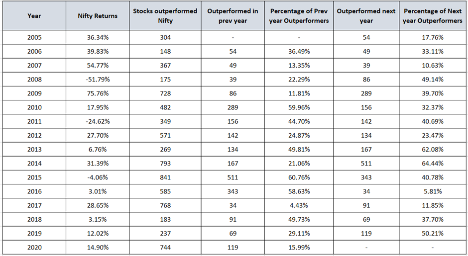
The above table captures the total number of stocks that outperformed the benchmark index. It also captures the number and percentage of current year outperforming stocks that outperformed in the previous year and the next year as well.
The numbers of outperforming stocks are more in bullish years and less in bearish years which makes sense.
When a market is bullish, but if the number of outperforming stocks is less, it means that the heavyweight stocks lifted the index and investments in those stocks would have yielded better returns. It happened in the year 2006. The theme in that year was large caps. There were years like 2015–2016 where markets were in a sideways mode but quite a few stocks delivered good returns during this period. Almost 60% of stocks in those years also outperformed in the previous year. The theme during such phase would be an investment in mid-caps, small caps over large caps. Better returns can be generated by doing that. In years like 2008, 2013, 2014 and 2019 most of the stocks that outperformed also outperformed in the subsequent year.
But on an average, about 34% of stocks from the current year’s outperformers, outperformed in the previous year also. And, close to 35% of stocks from the current outperformers list managed to outperform in the subsequent year as well.
Let us check the data if we consider the top 100 stocks that outperformed the Nifty every year.
NSE equity segment year-wise data showing the percentage of outperformers from top 100 stocks.
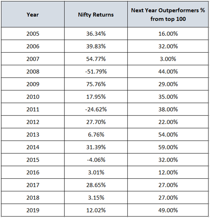
On an average about 32% of stocks of current year outperformers were previous year outperformers and outperformed in the subsequent year as well.
Before we take this discussion forward, let us consider other data points too. Let us take a look at the underperformers too. The data featured below shows the top 100 stocks that underperformed in the market each year.
NSE equity segment year-wise data showing the percentage of outperformers from the bottom 100 underperforming stocks.
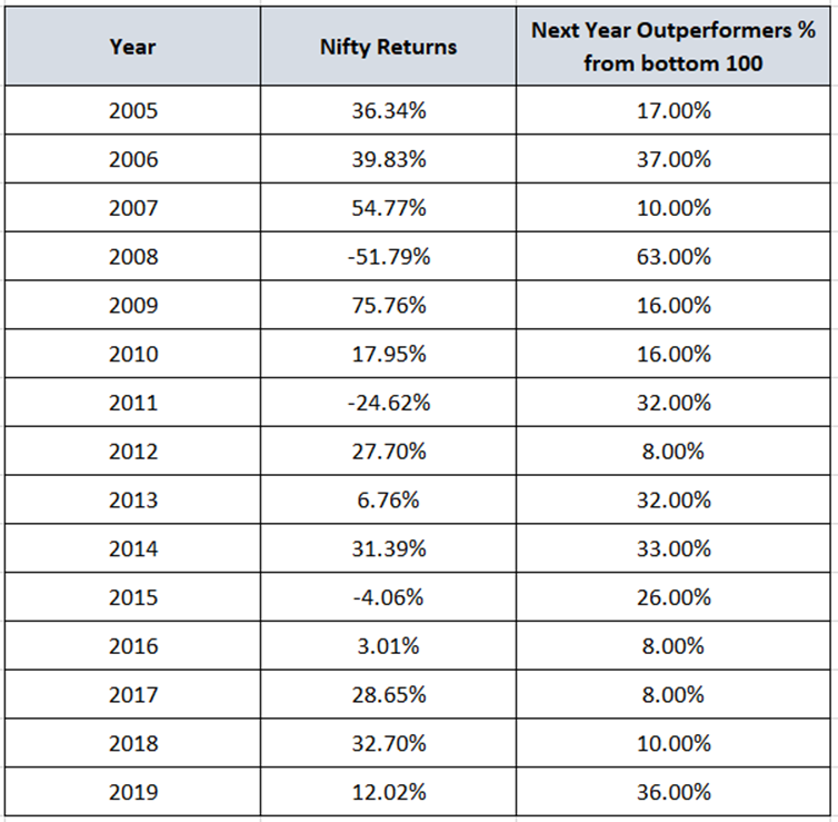
On an average, about 23% of underperforming stocks were outperformers the previous year and outperformed in the next year too. 63% of stocks that were in the bottom 100 in 2008 outperformed next year.
We can compare the above returns with the larger universe of stocks like the Nifty 500 as well, but the outcome will be almost the same. We will come to that point later.
The above studies were to illustrate how stocks behave on a yearly basis. Such studies can be performed on any timeframe including half-yearly, quarterly, weekly or monthly. The objective is to understand broad concepts and principles.
Here are three key takeaways:
1. Concept of looking at outperformers can be useful, but the trend of the Nifty (underlying benchmark) is important.
2. Confirmation and more tools are required to filter the list of stocks further
3. Knowledge of the market trend and phase can help us decide the theme to focus on. The theme here could be Large-cap, Mid-caps, Small caps, ETF, Bonds or Fixed returns, or bearish opportunities for traders etc.
The patterns of outperformance and underperformance discussed above are applicable on all instruments, and for different time horizons such as short-term, medium-term and long-term.
There are footprints of outperformance and underperformance visible across all time frames. You will get an idea when you analyse the performance and behaviour of the sectors and stocks during the move.
I have studied the behaviour of top-performing stocks over different timeframes. The same principles can be applied for different periods and timeframes. Sectors in sync with market behaviour tell us something and when they are behaving otherwise, there is a reason we need to analyse them more to find opportunities. We will explore these concepts in greater detail in the following chapters.
The same behaviour can be analyzed in a variety of markets, and sectors. There are some stocks or sectors which are the flavour of the season. They are the leaders of the trend and continue to outperform during most of the uptrend. Identifying them can prove extremely rewarding.
There are numerous methods of price analysis and indicators to design a trading system for deciding the entry and exit. But what is more important is stock selection. And the identification of the market phase is also equally important.
Our approach can be tweaked, or allocation can be planned to a particular theme based on the market phase. It is important to identify and decide if one should focus on index trading or allocate more funds to mid-caps, or shift focus to some other asset class. If you are a trader, trading gold would be more favourable if it is outperforming the Nifty. If you are an investor, you will be better off by investing in fixed deposits or bonds when the Nifty is in a bearish phase.
If we develop techniques to achieve the above things, at least to an extent, we can then achieve reasonably good performance in our trading and investments activity.
The stocks that outperformed in the previous phase, may not do well in the next cycle. We have discussed earlier that leadership changes with cycles. Every instrument goes through this transition across different timeframes.
Finding outperforming stocks and running a price-based system on them is the simplest form of relative strength analysis. A stock delivering a 200% return in a year will have to cross the 100% or 50% mark first. A possible method to pick winners is to track stocks crossing 50% or 100% return during the year. But it is important to have a logical approach to identify the stocks and instruments entering the outperformance zone, remaining outperformers and when they are no longer outperformers.
So far:
- You have understood the concept of relative strength and patterns of outperformance and underperformance.
- We studied the data to understand how different sectors performed in Indian markets and who were the market leaders. Studies suggests that there are footprints of outperformance and underperformance visible across all timeframes.
- There are some stocks or sectors which are the flavour of the season. Knowledge of the market trend and the phase can help us decide the theme to focus on.
- If we develop techniques to achieve the above things, at least to an extent, we can then achieve reasonably good performance in our trading and investments activity.
- The trend of the underlying benchmark is important. Behaviour of the numerator and the denominator is important to study the relative strength patterns.
We shall discuss the performance cycle in the next chapter.